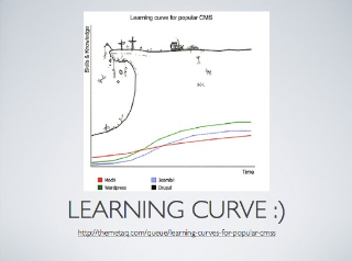
I like the whimsical chart even though it's not technically accurate because it sends the message across very clearly. Just one thing I'd change there is to move the CMS names from the legend at the bottom to immediately to the right of each plot. There's also more than enough whitespace in this slide that could've been used to make the chart easier to read.
Original slides are here.
